|
Social media and websites are commonly tools used in today’s time. No matter your age, gender, or beliefs, everyone uses websites and social media. Their importance is vast, ranging from the positive to the negatives. There is also a good reason for why companies and people nowadays use social media to create an online presence. Additionally, there are different methods, some which are effective, some which are not. But before we get there what are websites and social media good for? What is the good side and bad side of each? All of this will be discussed and thoroughly answered in this following blog. Websites are like your home base on the internet where you can show off everything about yourself or your business. They're great for giving all the details about what you do and making a good impression with your design. It's like having your own spot that's always there, ready for people to visit and learn more about you. But, they need regular upkeep and might be a bit trickier to set up. Social media is more like a bustling town square where everyone hangs out and chats. It's all about connecting with others in real-time, sharing cool stuff, and having conversations. Social media helps you reach lots of people quickly and easily, but things can get busy and crowded, and it's not as easy to control your message as on your own website. To really make your mark online, it's smart to use both. Your website is like your headquarters, where people can find all the important stuff about you, while social media helps you spread the word and connect with more people. It's like having a great storefront in town and also being out there, mingling with the crowd. Each has its strengths and weaknesses, but together, they make a powerful team for getting your message out there and building your brand. In the end, it's like having the best of both worlds! Your website is your solid foundation, like your cozy home where you can really showcase who you are or what your business is all about. It's where you can make a lasting impression and provide all the important details. On the other hand, social media is like the buzzing town square where everyone gathers to chat, share, and connect. It's where you can reach tons of people quickly and engage in real-time conversations. By using both, you're basically covering all your bases—making sure you have a comfy spot to call your own while also mingling with the crowd and getting your message out there loud and clear. It's the perfect recipe for success in the digital world! 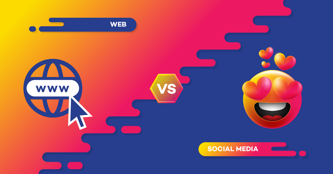
0 Comments
A well-designed website serves as a digital storefront, playing a pivotal role in shaping user perceptions and driving engagement. The visual appeal of a website, including elements such as color schemes, imagery, typography, and layout, contributes to creating a visually engaging and cohesive brand identity. Beyond aesthetics, intuitive navigation and user-friendly interfaces enhance the overall user experience, ensuring that visitors can easily find the information they seek and navigate seamlessly through the site. This combination of visual and functional elements is essential in establishing a positive first impression and cultivating user trust and interest. By prioritizing effective web design, businesses can captivate their audience's attention from the moment they land on the site, compelling them to explore further and engage with the brand's offerings. Moreover, web design extends beyond aesthetics and functionality; it also plays a crucial role in driving conversions and achieving business objectives. Strategic placement of calls-to-action (CTAs), persuasive messaging, and optimized landing pages are all elements of effective web design that encourage visitors to take desired actions, such as making a purchase, signing up for a newsletter, or contacting the business. Additionally, responsive design ensures that the website is accessible and functional across various devices, catering to the needs of users who access the site from smartphones, tablets, or desktop computers. By aligning design elements with business goals and user needs, a well-executed website becomes a powerful tool for driving growth, fostering customer loyalty, and ultimately contributing to the success of the business.  Inclusive design, rooted in the principle of ensuring equitable access for all users, demands meticulous attention to several critical design considerations. Among these considerations, optimizing font sizes and readability emerges as a fundamental aspect in fostering inclusivity within digital interfaces. By prioritizing larger font sizes and adequate line spacing, designers can cater to users with visual impairments while concurrently enhancing readability for all individuals. This approach not only removes barriers to accessibility but also promotes a more universally welcoming digital environment where every user can engage with content effortlessly, irrespective of their visual abilities. Additionally, adhering to WCAG guidelines regarding color contrast ratios emerges as another pivotal design consideration for fostering inclusivity. By ensuring optimal color contrast between text and background elements, designers can enhance the legibility of content for users with visual impairments while also improving usability for a broader audience. This concerted effort underscores the principle that inclusive design benefits not only individuals with disabilities but also the broader user base, thereby fostering a more equitable and user-friendly digital landscape. Moreover, embracing robust error-handling mechanisms stands out as a crucial design consideration in fostering inclusivity within digital interfaces. By providing clear and actionable error messages, designers empower users, particularly those with cognitive disabilities, to navigate interfaces with confidence and autonomy. Intuitive form design and autocomplete features further streamline user interactions, reducing cognitive load and facilitating efficient task completion for all users. Through these deliberate design interventions, designers can create digital environments that transcend mere accessibility compliance, embodying the ethos of inclusivity by prioritizing the needs and experiences of diverse user populations. Inclusive design, therefore, serves as a catalyst for fostering a more inclusive, equitable, and empowering digital landscape where every individual, regardless of their physical or mental challenges, can fully participate and engage with digital content.  3/21/2024 0 Comments Blog Post 5 - My Favourite Website Best Buy's website design is a prime example of modern functionality and user-centric design principles. The color scheme predominantly consists of a combination of blue and yellow, which not only aligns with the company's branding but also evokes trust and friendliness. The layout is intuitive, with clear navigation menus and prominent search functionality, allowing users to easily find what they're looking for. Typography is clean and legible, ensuring that product information is easily digestible. The use of high-quality images and videos further enhances the user experience by providing a comprehensive view of products. Furthermore, Best Buy's website design incorporates responsive elements, ensuring a consistent experience across various devices, from desktops to smartphones. The checkout process is streamlined and user-friendly, with clear steps and minimal distractions, making it easy for customers to complete their purchases. Interactive features such as customer reviews and ratings provide valuable insights and help users make informed decisions. The inclusion of promotional banners and deals enhances the shopping experience by offering additional value to customers. Lastly, the integration of social media buttons allows users to easily share products and engage with the Best Buy community, fostering a sense of belonging and connectivity. 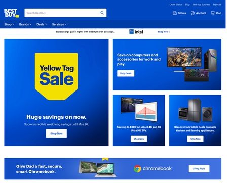 3/18/2024 0 Comments Blog Post 4 - The Hamburger MenuIntroduction Website menus: they're everywhere, sometimes helpful, but other times, just a hassle. Despite differing views, menus have brought vitality to today's websites, sorting out disorder and mess. Nowadays, there's a variety of menu styles on different websites, with one of the most common being the hamburger menu. Shaped similarly to each section of an edible hamburger, each row takes you to different parts of the website. Nonetheless, the real question is whether hamburger menus takeaway or improve a website's viewership and interaction. My View Luckily, Mr. Tran shared some insight about hamburger menus in both it’s effectiveness and ineffectiveness in his article. So based on the reading and my personal experience, I believe that hamburger menus is more of a positive than a negative. Firstly, the hamburger menu is a common style used among big companies and brands. For example, companies like Walmart, Costco, Tim Hortons, and Amazon use hamburger menus to organize and guide viewers to different parts of their website. It’s not only limited to these brands, but newer companies and old ones have started adapting this style. In fact, the hamburger menus have been labeled as the modern menu style of the 21st century. Due to the menu’s space efficiency, simplicity, and responsiveness, it swiftly grew to popularity. Secondly, the hamburger menu tackles disorganization and crowdedness within a website. These two factors are important in the web design industry as viewers could be discouraged or fed up if the design isn’t responsive, customer friendly, or confusing. The hamburger menu offers a simple and clear-cut solution by stacking each option row by row, each leading to different instances within a website. Additionally, the option list is hidden until a viewer taps or hovers the 3 dots or 3 lines. This avoids the cluttered feeling in the home page and gives the viewer a sense of professionalism and ease in exploring a website. Moreover, this style of menu is also a responsive design, meaning that it works across a variety of platforms and screen sizes. In accordance with the hamburger menu’s small size, it is easily scalable to fit different screens and platforms. Besides, it’s accessible and functional on both computers and mobile devices, thus making it a flexible choice for many web designers. Fourthly, the immense focus on the center content also serves as a bonus for using hamburger menus. By hiding menu options behind a single icon, the hamburger menu allows the main content of the website or app to take center stage. This helps to prioritize content and streamline the user experience by reducing distractions. Users can focus on consuming the content without being overwhelmed by a cluttered navigation menu, leading to a more engaging and enjoyable browsing experience. Opposing Cons Moving on, I would like oppose some of the cons listed within Mr. Tran’s article about hamburger menus’ positives and negatives. At first, Mr. Tran states that hamburger menus make whatever’s inside it less important. To me, this is not true, that is because hamburger menus are often the first thing that gain people’s attention. Most people don’t even scroll down a website, they ideally see the main center section, and immediately click on the menu. Most people click on the menu only because they realize it’s importance, this dictates that hamburger menus do not make what’s inside it less important. It’s important to realize that people today do everything in a rush, so considering their first instinct, they do realize it’s importance since their time depends on it. Another view Mr. Tran shared in his article about low engagement. While some studies suggest lower engagement with hamburger menus due to accessibility challenges, designers have adapted by implementing strategies to enhance usability, such as larger touch targets and alternative menu access points. Additionally, user habituation and effective content organization can offset any perceived difficulty in reaching the menu, ensuring continued engagement with the website or app. My Final Thoughts In summary, the hamburger menu is still useful in today's website designs. It helps save space and keeps things neat, especially on phones. Although some worry that people might not use it much, with good planning and as people get used to it, it can be a great way to help users find what they need on websites, especially when they're on the go. 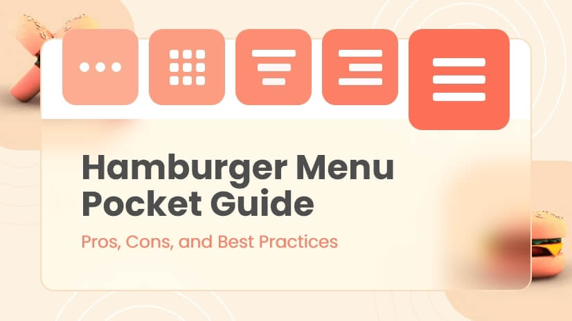 |
- About me -
|